For the uninitiated,I recommend reading about Inktober to get up to speed. Now, I don’t want to delve much into the details of the challenge. It’s more about how I got to the piece I designed, and the illustration process involved. Not so much about the experience of the challenge. Don’t worry, I’ll summarize all in the next paragraph.
I won’t be doing it again! 😂
There’s no denying the fact that it was a good exercise to tryout. In fact, I do think you should give it a shot, especially if you are someone like me who likes to push themselves. With this challenge, though, there are no winners. It’s a chance to test your artistic skills only.
In my case, I was already working on improving my line art process and speed. To make the challenge a bit harder, I opted to color each piece.
A sidenote, I’d showcase all illustrations here, but the best one was the final piece. I’d prefer to talk about the illustration process of the work than anything else. 😁
As for doing the whole Inktober challenge again, I’m not sure whether I will. It was fun, but it was a bit too much, towards the end. Experiencing it once was enough for me, and it served its purpose.
Table of Contents
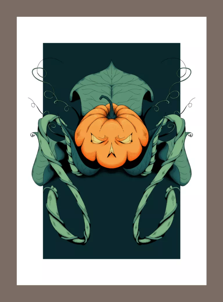
It was a slithering risk, but I made it!#
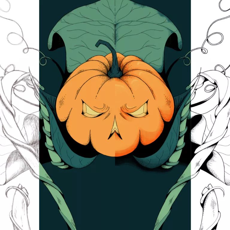
As the name of this post suggests, this was a twofer piece Slither and Risk. Each prompt was for a different day, and they landed at Halloween. I decided to combine them and made sure the final digital illustration was special! 👻
My aim was to push myself further by getting each day’s prompt done in advance and managed to color them, too. I wanted to take the opportunity to get better with the digital line art of the illustration process. The aim was to go beyond pencil sketches and shading.
As it turned out, each day’s exercise became the basis to build up on the following day. A new step in improving my illustration process.
Jack O’Lanternius Slitherisk – The Illustration Process#
I drew the piece in Krita. This is an A3 sized piece at 300dpi (dots per inch). The color profile I used here is RGB.
About color profiles. While you can get your work printed by professionals with RGB, there’s a good chance it won’t be on par with the original. Try to look into working with CMYK first. Make an informed decision before starting and regret the print.
I chose RGB because I don’t print (at least not yet).
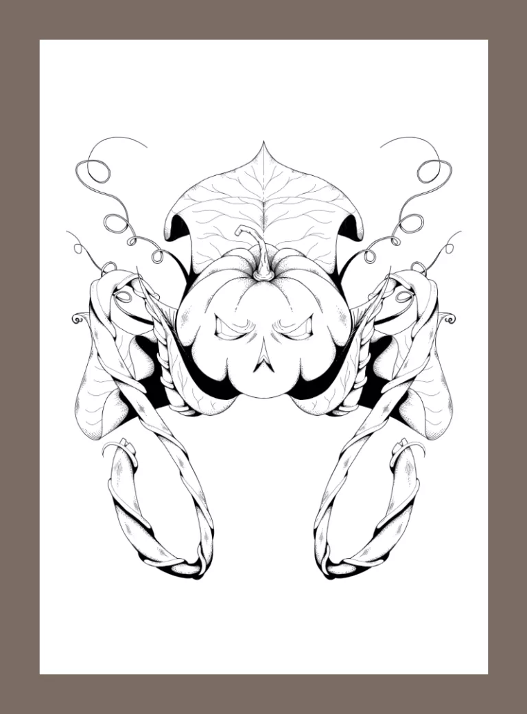
Sketching#
I used the Mirror Tool as a time saving measure because it was going to be a symmetrical piece.
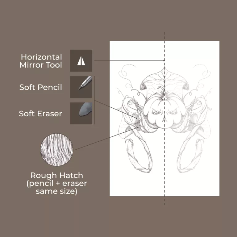
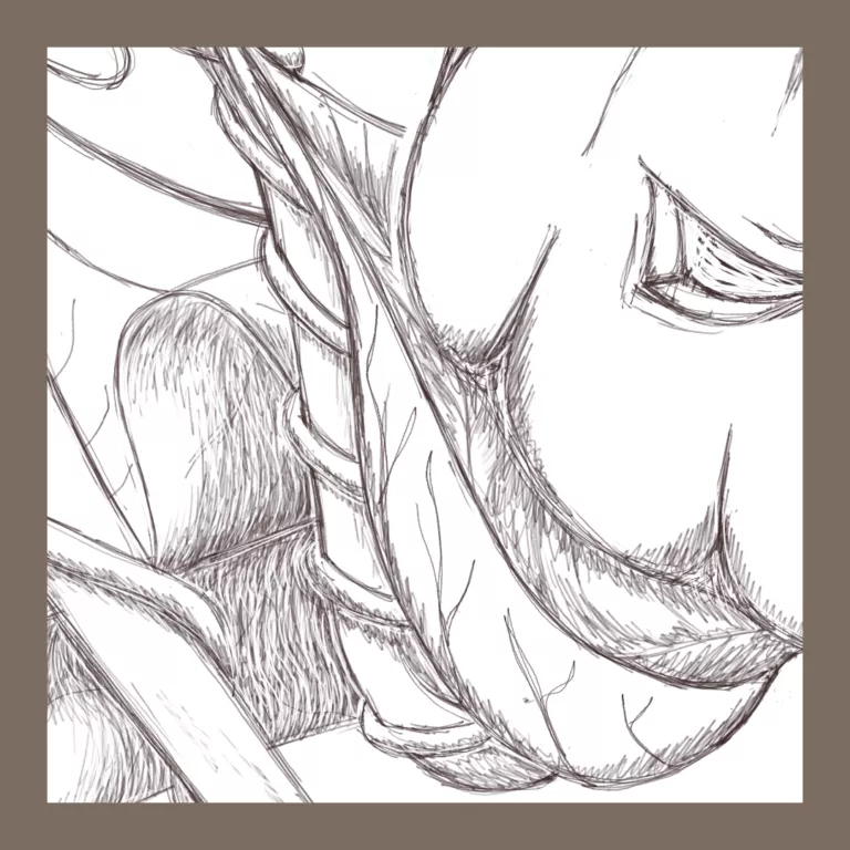
When I sketch, I always use the Pencil Tool (6px), even if it’s a digital. I find that it helps plan out the line work. If I decide to keep it a pencil drawn digital illustration, I clean it up and then reproduce a higher shaded render. If I want to line and color it, then I do so.
Line art#
I started with 3px and then used different sized brushes, from 2px to 6px for details and contouring.
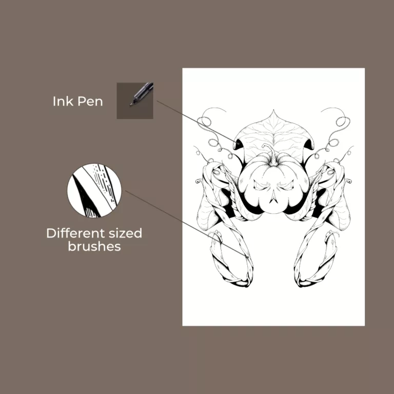
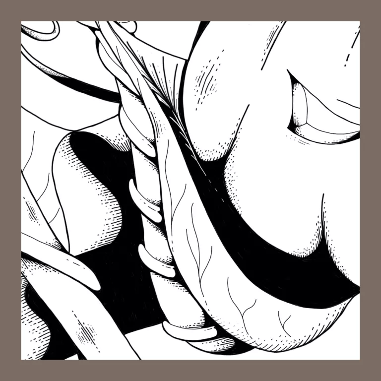
It was the first time I used this approach in a digital illustration process. Starting with 3px was a good call. It gave me room to contour different parts to emphasize depth of form.
I filled the darkest parts to highlight the head of the illustration. Otherwise, it was getting lost in its surroundings.
Coloring#
Now, I’m still figuring out the best method of color flatting a digital illustration with Krita. The magic wand doesn’t feel right. Compared to Photoshop, or Affinity Photo, there’s a lack of supportive features to finesse on the go.
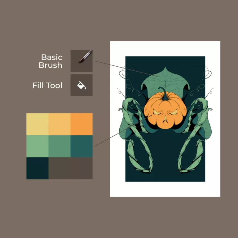
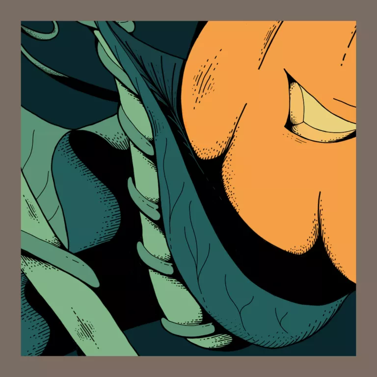
How I do it now is more of a bucket fill, after I outline with a brush. Crude but effective.
Shadows & Highlights#
I wanted to try screen-tones. It was an experiment to see if I could use it for highlights and shadows since it’s pressure sensitive. On all the greens, I used the same colors to apply it. For the pumpkin and the cast shadow, I used black with the Soft Light (SVG) property.
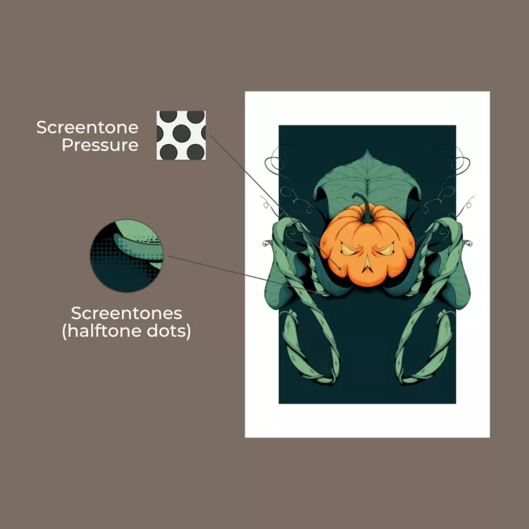
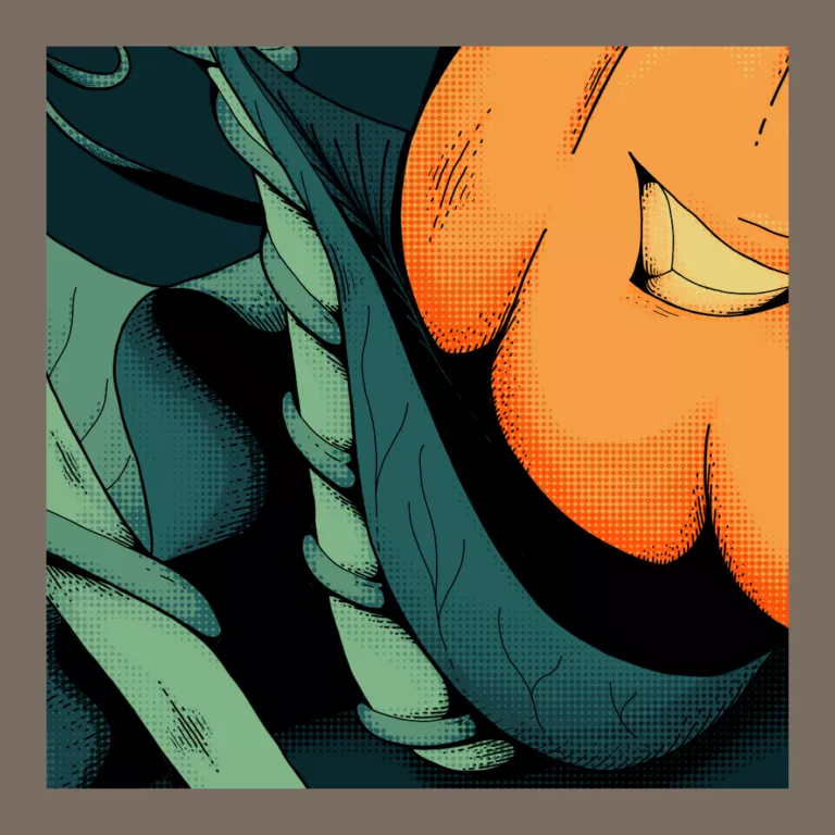
I’m looking forward to using this texture more as part of the illustration process, as it worked out very well.
🎃