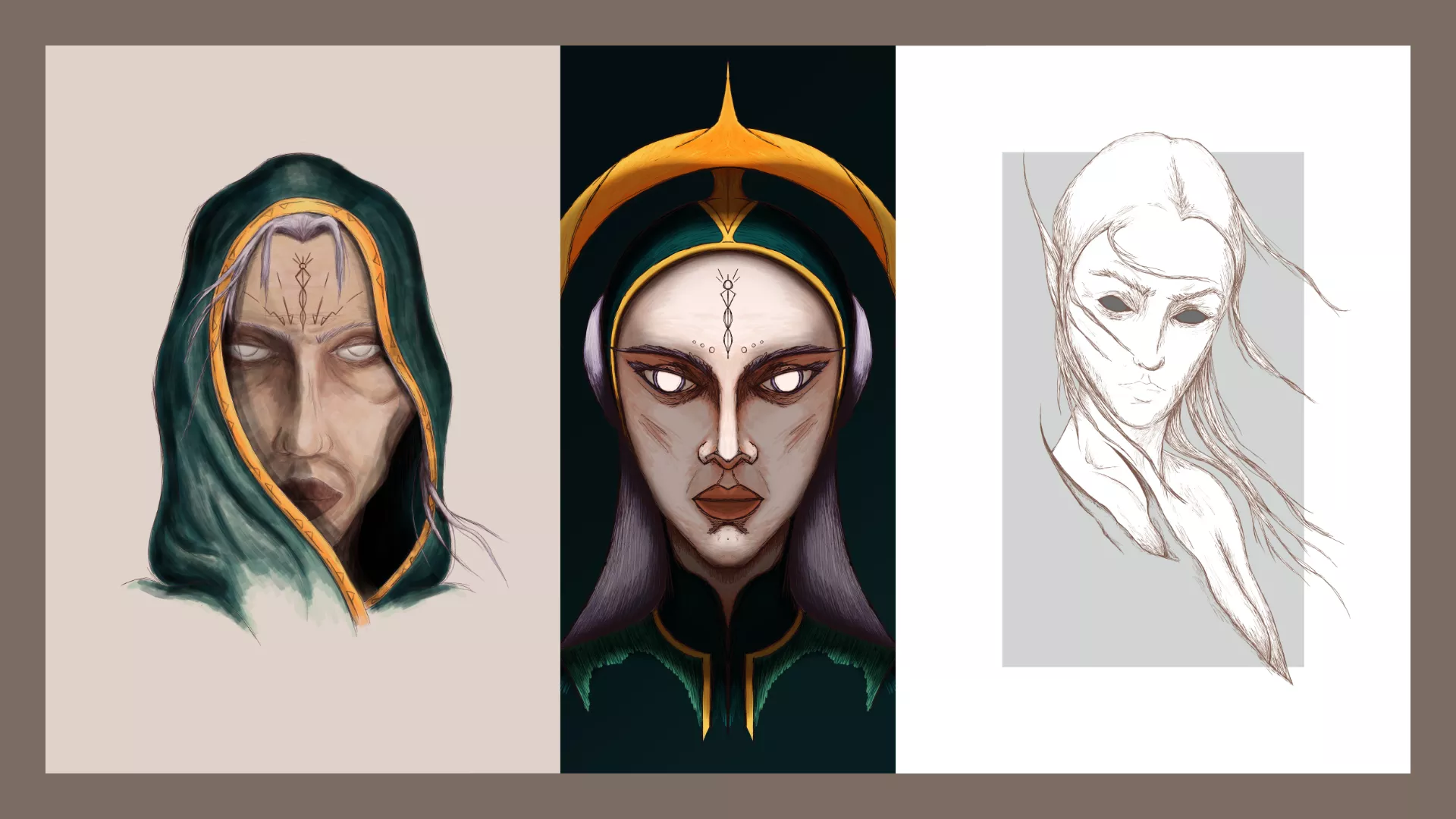
I have many characters; Rogue, Amara, Sina, Nari, Blossom, Sujet: Xeno, Vectra and Demonoid. If you have browsed through my previous posts, you would have seen them, here and also here.
Table of Contents
Characters that create challenges…#
I created each one of them with their own characteristics. Amara, for example, is a mermaid born out of Mermay – no connection to what seems to be a month-long contest. Her main feature are the jellyfish-like tentacles. Nari, is a tribal elf. Sina is a disgruntled old witch who is half human and half elf, and so on.
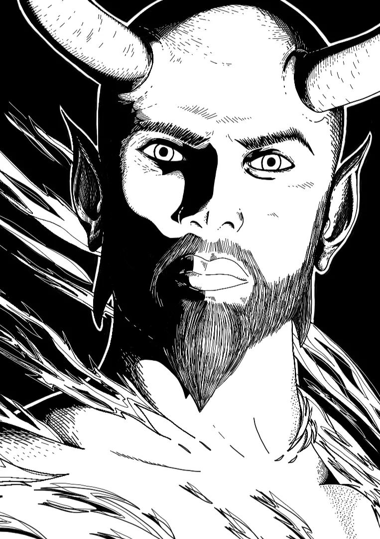
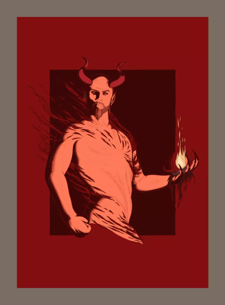
Creating these characters helps me do different studies. They throw me into the deep end and challenge me in their own way. Demonoid is no exception. I needed to create a male character with a sexy dad bod. 😅
Demonoid – The Illustration Process#
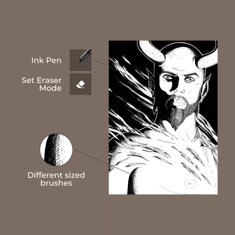
I drew this piece in Krita. The canvas size was A3 at 300dpi, with an RGB color profile.
Reference & Sketch#
I created the model in DAZ Studio. This is the third time I’ve used it for a piece. This needs a post of its own to get into the “do’s” and “don’ts” with 3D referencing as part of the illustration process. Yet, the conclusion is: it’s good for creating poses and lighting references, but it does take time to learn it.
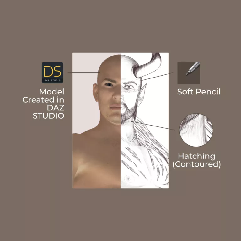
I imported a PNG render of the model and made a rough outline. Then, I shaded it using light contoured hatching. To cover large areas of the body, I layered the shading. Instead of relying on pen pressure, I used Krita’s Flow options to go from light to dark.
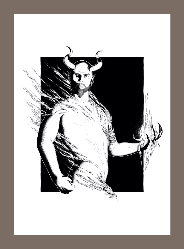
Line art#
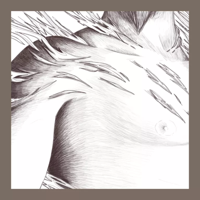
One thing I’ve started appreciating, more now than before, is how the prior step helped make this step easier. Pencil shading, it seems, helps to determine the line work in the illustration process.
The reasoning is actually quite simple. Through the pencil work, I made decisions in the shading’s flow. In turn, it helped determine where the virtual ink of the line art is going to go. Speeding things up!
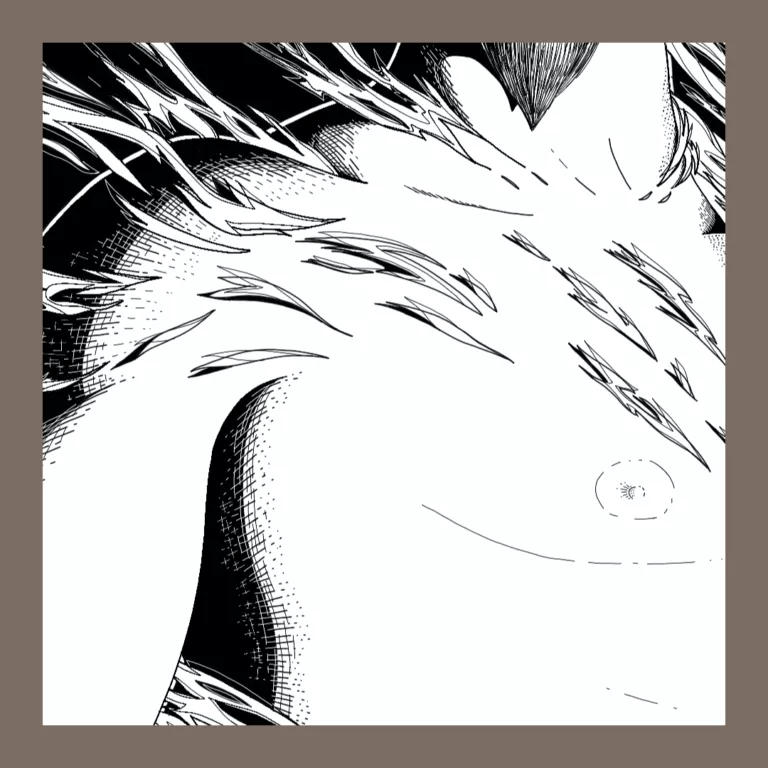
Hatching, cross-hatching, stippling, and contouring. I took out the line art gauntlet to get this piece done. I also used the “set eraser mode” which lets me use the Ink Pen in the negative space. That helped the cross-hatching give that transition you see from black to white.
Coloring#
Krita has a color palette called Concept-cookie, and I’m in love with it. When I apply shading, I use black with adjusted opacity and “Multiply” property. For toning, I use “Addition”. The amazing thing about this palette, is that the resulting colors are a close match. Helping me to rework them to the final result!
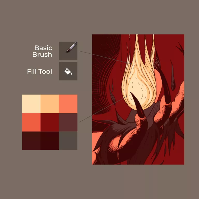
The “color selection tool” (Eyedropper), seems to look for the nearest neighbor. As, the color palette is already huge, it’s hard for it to miss. Which is cool!
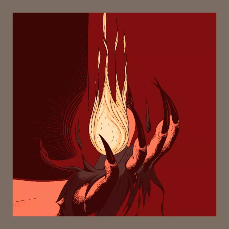
Shadows & Highlights#
To help give the body some added form, I tried the shading method I used on the edge parts of the whole body. But the block-like color ruined it a bit by emphasizing it too much.
So, with the same method of shading, I used the Screen-tone Pressure brush.
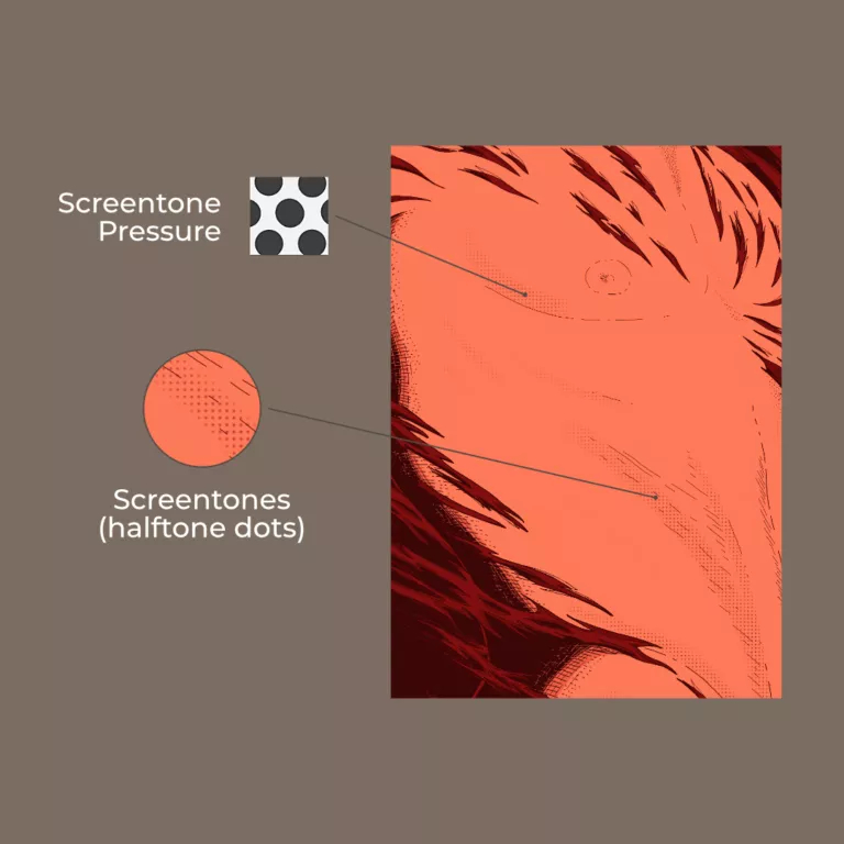
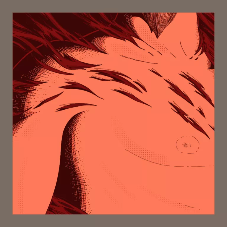
That did the trick! 🥳
While I do like how it all turned out in the end, I still prefer the inked version of the illustration process. 🤷♂️